SURFACE THERAPY #4: LAYERING (STORIES)
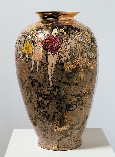
Grayson Perry, Precious Boys, 2004
The penny drops, makers and voyeurs, dirty laundry, royal glory, five good reasons, Hephaestus, savant, mash-up and clarity
compiled by Daniel Skeffington
ABOUT SURFACE THERAPY
Layering (stories) is the topic for the fourth in the series of glaze and surface related articles. These studies are in response to requests from the JAC readership and intend to be a starting point through the information maze. Our aim is to discuss the origins of types of glazes and surface treatments their context in contemporary clay practice, a brief scientific overview of how the glaze works and also to bring a practical lens in seeking wisdom from experienced practitioners of those surface types we feature.
LAYERING (STORIES)
When considering the taxonomy of glazes and surface treatments, a pot that is ‘layered’ is hard to place, as there must be an infinite number of variations in such a category. What is layered? Is it two or more applications of different medium on the one vessel? Can two or three or four applications of the same medium, perhaps slip or terra-sigillata, be layered? Is the nano surface of silver nitrate particles applied to a glazed pot, now a lustred pot, layered? An understanding might be found in an examination of why we do it. Let's get layered.
BEAUTY
Treating a pot surface with multiple applications of glaze, slip, decoration, additives, decals, tissue transfers etc. is nothing new. Historical examples are not as vibrant or overt as our contemporary multi-media, highly narrative work, however they are still significant examples in the ceramic record. In the Quong, Song, Fong dynasty, or whatever, it doesn’t matter which one, an artisan’s apprentice had a bucket of Tenmoku and a bucket of Celadon and a bucket of iron-saturated slip. In his drunken care of a dragon kiln firing one night he layered some of his masters 2nd’s – just to see what would become, and slipped it into the kiln before it got too hot. Out came a spectacular Hare’s Fur glaze and he was immediately elevated to Master status. Nice story, but I made it up by way of introduction to the unknown historical origin of layering. What we do know is that there are some stunning examples of ‘glaze on glaze’ glory in the historical record. Hare’s Fur and Oil Spot are among them and like most traditional oriental glazes are beautiful and often mesmerising. (What is even more outstanding and like Oriental glazes, is that, often the glazes that are fired upon each other are often outstanding glazes in their own right). So a good excuse, my number one reason, is to use layering to create objects of beauty.
In the Ceramics Arts Daily article, ‘Oil Spot and Hare’s Fur Glazes: Demystifying Classic Ceramic Glazes’ John Britt describes the chemical process which occurs when an iron-rich sub-layer is covered with subsequent layers of different glazes. At high temperatures, oxygen dissociates from the iron molecule and bubbles to the surface of the top layers, bringing their particulates with them, discolouring and adding colour variations to the top layers’ appearance. (Don't forget to ‘soak’ so the bubbles will dissolve and leave their transported passengers visible). Oil spot and hare’s fur glazes may result. These are immediate examples of the brilliance of historical layering knowledge and the harvesting this knowledge can deliver.

Above: Silver Iron Cup (detail), porcelain with a hare's fur combination glaze - two coats of John's SG-12, one coat Candace Black, and one coat of Hamada Rust, cone 10 oxidation; photo: courtesy HERE.
STORIES LAYER BY LAYER
In layering a surface the narrative that is made can give meaning, each layer having an innate story. Sometimes the meaning can simply be intentionally decorative but, as we will see, even decoration can be profound. Meaning can occur in how each application is laid down, in the combination and the order, its inspiration, its individual parts and in the resolved combined outcome. So layering can be a vehicle which offers effective communication – the syntax between maker and voyeur.
MASTERCLASS: LAYERING = DECORATION = MEANING
Why is layering used then if all we want to do is to tell a story? Why not just paint a picture on the pot?
For Christopher Taylor of Devon, UK [1] layering has become his thing. Layering adds context, substance, complexity, clarity, interconnectivity, disruption and additional narrative to what he wants to communicate. Chris is a graduate of the University of the West of England studying under the famed Walter Keeler. For nine years thereafter he worked in assistant roles in British craft studios before completing his MA at the Royal College. A scholarship sent him to Jingdezhen where the penny dropped, surprisingly not in the studios there but on the many cement-covered fences enclosing the numerous clay establishments. Chris was struck by the patterns and textures he could see of the many posters posted on top of each other, which were often degraded over time – residues and overlays. Each poster had an individual message, but each contributed to a combined story as well. The image spoke of human patterns, human activity. Their merging created patterned surfaces which inspired Chris to explore existing protocols in pattern arrangement.

Above: Patterns and formal arrangements – inspiration from a most unlikely source; photo: courtesy Chris Taylor

Above: Detail of a Chris Taylor ‘pot-scape’; photo: courtesy Ester Segara
Clay became a canvas for Chris to explore formal and unconventional imagery and decoration. With the multitude of options for decorating ceramics, (slips, oxides, glazes, decals, lustres), there is a richness, a clear demonstration of what clay is capable of. Chris says, “we can’t do this in the same way as with glass or paper”. He uses many techniques including ‘anti-layering’ – altering and removing in part what has been applied using angle grinding, sandblasting, rubbing back and scratching). “My first layer is the pot itself. I use a highly grogged earthenware in oxidisation, as each piece might be fired up to six times. The grog helps to prevent cracking. Clay colour considerations are important, as my later distressing activities will often bring this surface into view. The clay resembles brick clay – a reference to my initial influences. I apply a well‐fitting slip where each layer (of up to 4 layers) might be a different colour and often with a layer of under‐glaze print sandwiched between the slip layers. There are many slip recipes but the one I find suits my making is this one.”
CHRIS TAYLOR'S RECOMMENDED SLIP
See the attached Glaze Record Sheets
Slip, 1060C (cone 04)
- HVAR ball clay [2] – 66 (clay with plasticity)
- China Clay – 22 (for body whiteness, in slips it gives fluidity at slop stage, viscosity control during molten stage, adds stability to final glaze)
- Potash Feldspar – 12 (a natural frit containing glass-former flux, acts as a slip stabiliser)
Optional additions
- Add 10% Lead Sesquisilicate [3] (Ferro Frit 3531, gives control over slip fusion assisting in a more consistent rate of fusion)
- Add 10% pigments – (to give colour)
Chris’s notes on this slip: This makes a pretty good white slip that sticks well to the pot at 10600C, (cone 04). Crucially the ball clay must be one that has a low melting point so that it melts slightly at 04. This helps to alleviate shelling after glazing. I include about 10 parts Lead Sesquisilicate [4] in the slip with a view that this helps it to melt a bit, making the colours more vibrant. Pigments added are from 10 parts upward depending on the colour response required. The work is then bisqued. Next I add a clear glaze and again fire to 10600C (cone 04) with a 10-minute soak.
CHRIS TAYLOR CLEAR GLAZE
(note: also see Surface Therapy #3 (attached Glaze Sheets) for Janet DeBoos Clear)
I use Michael Eden’s Lead Sesquisilicate glaze [5], but have added an alkali frit to help with the fit on the grogged clay.
Clear Glaze, 1060ºC (cone 04)
- Lead Sesquisilicate (Ferro Frit 3531) – 71 (gives control over glaze fusion assisting in a more consistent rate of fusion)
- China Clay – 18 (gives fluidity at slop stage, viscosity control during molten stage, adds stability to final glaze)
- Flint (Silica) – 6 (Glass former)
- Alkali Frit (Ferro Frit 4131) – 5 (reacts with acids under heat to produce glasses in the glaze)
Option for coloured glassy glaze
- Add the usual colorants or stains (trialled proportions) – (gives colour)
Note: glaze is sieved through 120 mesh to assist with gas expulsion during firing.
Then the fun continues! I use many decorating techniques after the clear firing. Angle-grinding, sandblasting etc. This exposes the layers underneath, revealing stories, and causing scratches on the surface and sharp edges on the layers, including the clear glaze, as it is particularly glassy. This is easily fixed with another visit to the kiln melts and softens the edges of the glaze.
Next I apply stencils, decals, resists and lustres each in their own turn or in combination. It depends on their firing maturation. This builds up additional layers creating works where the layers act as a record of activity during my making process. When it's all finished, my pot tells the story of patterns referencing tradition and also creating new arrangements.
I use layering because I am interested in pattern and how it can create narrative and visual interest. The techniques I use are inherently ceramic and consequently highlight the various qualities that a ceramic surface can possess. They highlight the beauty of the material whilst giving a sense of authenticity to the surface – decoration, formal/informal, naturally occurring. The process in itself is a pattern. I see our humanity within the incidental patterns and reoccurring themes we create in our lives, so I seek to document this using the methodology described here.

Above: Chris Taylor, Jar, 2015
For those wanting to try their hand at the Taylor way of making, Chris has a few passing messages of hope: “Be open-minded when considering decoration, you can always over-layer what you don't like. In a similar fashion, cracks in the work aren't necessarily failings – they can be exploited to mean something else. Don't discount your seconds – they have the potential to become a source of discovery. When we explore, that's when interesting things happen”. This man is layered with experience, wise beyond his years!
EXPLORING WHAT'S POSSIBLE – MASH-UP
Peter Karner, Denver, USA, uses wax resist and glazes in his layering. His effects are achieved through the alchemy of the various glazes and the firing process he employs. Each glaze interacts with the others as a result of the order in which they’re applied. There is an obvious plan in Karner’s use of layering, yet there is a freedom in the result. The telling consistency of his output reveals to the observer Karner’s rigorous trialling and documenting discipline. This technical precision and glaze know-how is a considerable part of Pete Karner’s making.
This is a third reason for layering – exploring what's possible – but always with a measure of background knowledge. If you really want to get fancy, there is the replication of the result to authenticate the initial results. “Layering is an explorer’s art, but unlike some ill-fated brave hearts, if you don't make a note of where you’ve travelled, you won't be able to go back or move forward, let alone go to the same place again. So DOCUMENT”.
WITH A LITTLE UNDERSTANDING BY PETER KARNER
I always begin my glazing with shino-type glazes. As the old adage goes, ‘Shino first or be cursed’. My copper-saturated glazes on top of shinos give my glazes a deep, rich spectrum of colour. If I were to apply copper under the shinos, I’d have an atrocious mess.
I use wax resist and brushes to create geometric patterns on top of the shino, then dip in a copper saturated glaze, and then brush iron glaze on top of the copper.
The atmosphere in my kiln is crucial. I fire to Cone 10 in reduction in a gas kiln. My glazes require precision in the timing and amount of reduction. Another critical factor is the peak temperature reached. Over the years, I’ve become adept at judging this by viewing the cones inside my kiln.
Another important consideration is the thickness of the glaze application. I attempt to have a spectrum of colours ranging from mossy greens to rich blacks. This is achieved through calculating the specific gravity of the glazes in their buckets and the length of time that I hold the pot in the glaze when applying. I’ve come to perfect this process through years of experimenting and documenting.
If I were starting out to explore this technique, I would find a base glaze on which to decorate, one that is stable and relatively neutral in colour. Then, start experimenting with other glazes that have oxides or stains to add colour. For beginners, simply using brushes to create patterns with iron oxides on top of shinos is a reliable starting-point. You can do a lot of different things on top of shino, so my suggestion is to just try it. However, to my knowledge, shinos are only reliable in a reduction atmosphere.
For inspiration, check out this man’s explorative journey with patterning using layering methods of multiple glazes of different genre – Ceramics Arts Daily: The Irresistible Surface: Layering Pottery Glazes and Trapping Carbon to Create Loosely Geometric Repeating Patterns. February 3, 2016. Peter Karner.
See the attached Glaze Record Sheets from Peter Karner: East Carbon Trap, Green Black, Ohata Kati
Also go to peterkarnerpottery.net

Above: Peter Karner, Canister, h.45.7cm, d.23cm, carbon trap glaze with wax resist pattern, green-black copper glaze and iron brushwork; photo: George Post

Above: Peter Karner, Large Lipped Platter, h.10cm, d.40.6cm, Shino glaze with wax resist pattern, copper saturate and iron brushwork; photo: George Post
EVERYBODY'S GETTING INTO THE ACT. BUY AND TRY!
There is now a conveniently viable alternative solution to achieving ‘glaze on glaze’ layering effects. Using proprietary glazes specifically developed for the exploring hobbyist, school student or entry-level glazologist is now a significant focus for glaze marketers Amaco (www.amaco.com). They have developed a product, Potter’s Choice Glazes, focused on approximately 15 base glazes and then adding a choice of many additional glazes to go on top of these or on each other. They have been developed to approximate reduced stoneware glaze types like Hare’s Fur, Rutile, Oil Spot and Tenmoku; yet note, they are fired to Cone 5–6.
The benefits of using these pre-mixed glazes are several:
- Only limited personal scientific or practical knowledge is needed to use pre-formulated glazes
- There is no need to stock, source or purchase individual elements of any one glaze in the exact amounts
- Reduced risk of glaze-based toxicity in making glazes
- The testing has already been done
- There is an online (and hardcopy), visual library of the combinations achievable. This means you can identify the outcome you seek for your pots without doing the hard work
- The visual library will also prompt your imagination for results you may not have thought of That being said, it is still recommended to test before applying to a kiln-full of green ware as factors such as clay body choice, glaze application technique, kiln conditions and firing regimes may alter the outcome.

Above: Grayson Perry, Precious Boys, 2004, glazed ceramic, h.53cm, w.33cm

Above: Grayson Perry, Precious Boys, detail, 2004, glazed ceramic, h.53cm, w.33cm
POTTING ROYALTY
Layering is a technique used to facilitate the ‘reading’ of a vessel – both its narrative and its form. For Grayson Perry, UK savant and prodigious bastard (not in the illegitimate sense), layers of surface on his pots reveal the secrets of the past and their context to the present –he tells his tales through these rich filters of application.
We antipodeans have recently been treated to a spectacular review of Perry’s oeuvre at the Museum of Contemporary Art, Sydney. [7] Here the weird and wonderful, the underbelly and dirty laundry of contemporary British life, Perry’s own personal mythology, and comment on everything from crass commercialism to the most intimately perverse sexual act, are all there for conversation. It's as if Perry is literally flashing at us with unexpected surprises underneath his trench coat. There are layers to each topic and each has many perspectives. These are profound personal statements, revealed to us in all their glory … their rich, royal glory. The richness of Perry’s layering of his high-chrome pallet, his provocative imagery and the grandeur of the forms – all add to a mix where our ‘reading’ of the work is guttural, immediate and opinionated. I want one!
So our fourth reason to use layering is to add a physical lushness that compliments the maker’s message, helping to provoke a response. In fact, if you consider the great halls of the British Museum with their rows of Greek, Etruscan and Mesopotamian vases, Perry's work is not too dissimilar. For these peoples, vases and urns of clay were their canvas. Here the vessels (usually of similarly large proportions as Perry’s) are layered to varying degrees using slip and variations of ‘terra-sig’ and like Perry, tell stories of every day life – at the baths, the market, down the street, at war, the social issues of the time, and also of provocative, sensational, in-your-face accounts of the goings on. They must have been spectacular, provocative and novel when first admired – similar to Perry's Sydney MCA review. If the God of artisans (also appropriately of fire and volcanos as well), Hephaestus, died with the glorious mythologies of the ancient Greeks than Perry is the next best thing, so perhaps in my imagination he cannot be anointed by a long-dead God but he can at least be crowned royalty. He has, after all, changed his potter’s mark to include a crown symbol above his original ‘W Anchor’ mark, post Turner prize. Long may he reign!
Perry uses the familiar shapes of the Orient and antiquity peoples because he doesn’t want you to see them! “I’ve got a lot to say so I need big surfaces, these shapes give me space. I also want to use the cliché form so the viewer will be so familiar with this that they look at the drawings, the stories, the narrative and not the pot per-se”.
TECHNIQUE
So what of Perry’s layering technique? “It evolved over time. I learned the basics at evening school but then essentially self-taught what I needed to know after that. I’ve never been trained in what I do now – it’s evolved to here. Coiling and slip work are the backbone, the foundation of my artwork – like an architectural framework for my edifice. I use a very reliable, tried and true clay. I’m not interested in experimenting as if I suffer any kiln issues I lose four weeks of work on one pot. I fire very, very slowly – five degrees each hour up to 200 degrees then I will ramp it up – slowly. I mix slips by eye and experience – no measuring, no formula. I use stains by the bucket load. I’m not particularly interested in the ethos of the magic of colour through the combination of traditional elements and chemicals, although I do use them. My one aim is to get what I’m looking for. The ‘gifts of the fire’ thing is not for me. I don’t want gifts that your aunty gives you one Christmas and you re-gift them next year. You know what I mean! When I open the kiln I don’t want surprises as my one pot per month output means that if I stuff up, I lose 1/12th of my year’s output. 80 precent of my work on each pot is done before I fire. They are monuments to me. Glazing is simply the icing on the cake. I don’t use many glazes because they run. No glaze is going to rain all over my drawings – if I can help it. So I only ever use one glaze – this is the gloss clear – a commercial lead glaze that’s in this bucket”, he points at it, “from a supplier at Stroke-on-Trent. Lead will heighten the colours. It gives the silk screens a crisper, deeper image. I prefer silk screens to digital prints as these always have a ghostly grey, ‘deadness’ quality. I use whatever I need according to the effects I’ve planned for and how I need to work the surface to get there. I’m not a purist”.
PLANNED PROGRESS
“The difference between ceramics and oil painting is that with painting you can always go back, work over stuff that’s not satisfactory. With ceramics it’s not so easy, so each one of my works is a masterpiece of planning. I make a long list in planning for each pot. It’s all about organisation. At the end of the process it feels as if I’ve winged it – but this is only because I’ve put the work in early enough”.

Above: A page from Perry’s notebook details the planning of the layering sequence of a well-planned ‘monument’, a valuable insight into how one potter plans his work. Similar material has recently been published by Penguin, "Sketchbooks"; G. Perry [8]
“It goes: bisque with slips, glaze and underglaze drawing firings, up to two decal firings, then digital transfers, then lustre (commercial) might be the last firing. I always have the same process”. (You would obviously start the layering after bisque from the highest temp element to the least highest. Otherwise your layers will be taken over by each successive one – not a good look). “My suggestion to folk wanting to try layering is to learn what works – find your voice then stick to it. There is of course an element of innate skill in all creative endeavour, particularly about colour. When I see art that’s not as successful as it could be, I think it has fallen short because of the colour choices that have been made. Sometimes its best to ‘knock it back on the pallet’. ‘Less is often more’ is a particularly sobering mantra to uphold”. So the prize goes to the brave and here’s the rub: for Perry it’s being brave in narrative, with a planned outcome. This was his way to the prestigious Turner Prize in 2003. For others exploring and being prepared to take risks to see what happens is a thread we see in our first three contributors’ modus operandi.
LAYERED DOWN UNDER
So, what’s happening in the Southern Hemisphere? Is there a brave soul here? In fact, there are and have been many brave southern souls – think Peascod, Mincham, DeBoos, Benwell, Orchard …
Clare Unger [9] is an Advanced Diploma student at Hornsby TAFE campus, Sydney, Australia. In her making Clare uses layering in both the surface treatment and the construction of her work. Thinly rolled sheets of clay (usually Keanes porcelain paper clay or Stoneware 7), are treated to a series of decorative processes including imprinting with texture from fabrics, mesh, wire; screen printing with either text or photographic images; and the application of tissue transfers. The clay sheets are then torn or cut into smaller pieces and placed in an overlapping manner onto a pre-prepared mould. A random pattern results.
Once the piece has been removed from the mould and the shape refined, the surface is enhanced with terra sigillata, underglaze colours and oxides during its transition from raw to bisque and through several low and/or mid-range firings. Clare builds up the surface until it speaks of completion. There is no set plan, just a slow evolution. Her technique creates a depth of colour, a richness and complexity to the surface, emphasising the texture of the individual torn clay pieces.
Clare’s technical inspiration comes from ceramic artists Christina Schou Christensen [10], a Danish ceramicist and Rafa Perez [11], Italy, who both work in a creative, experimental way with clay and glazes. “They’re not bound by pre-conceived ideas about ceramics or making”, says Clare. “For me, my 'now’ is a synthesis of people, places and events – this is my past, my DNA, and also of my ‘current’. These are the layers of my life. My making explores this. Each pot brings a disorganised set of experiences together to make meaning and understanding. I guess it's my kind of personal therapy – like others might go to the gym. Beauty and richness of the ordinary and the day to day are part of the overall idea. It's a sobering experience to fully realise my self-expression when making. Layering adds to my vocabulary, my voice”. (Authors note – Clare is a Perry devotee!)
Number 5 good reason for layering … it’s a synthesis – a consolidation of random things. It brings clarity.

Above: Clare Unger, Fragments III, 2015, Mu Gallery, Sydney, Imprint Exhibition 2016[/caption]
SUGGESTED RESOURCES
JAC online resources – glaze record template:
WEB RESOURCES
- christaylorceramics.co.uk
- peterkarnerpottery.net
- ocula.com/artists/grayson-perry
- clareungerceramics.com
- pinterest.com/delicion/glaze-recipes/
- ceramicartsdaily.org
- ceramicsrecipes.org
- Material Data Safety Sheets - msds.com
BIBLIOGRAPHY
The Potters Dictionary of Materials and Techniques. F. Harmer. University of Pennsylvania Press; 2004. ISBN 978-0812238105
Notes for Potters in Australia, Vol. 1 Raw Materials and Clay Bodies. Ivan McMeekin. NSW University Press Ltd, 1967. ISBN 0868402095
Glazes and Glazing Techniques - a glaze journey, Greg Daly, A & C Black Pub, 2003, ISBN 0713642769
Glazes for Australian Potters, Janet DeBoos. Cassell, Australia. 1978, ISBN 0726922129
Slipware ‐ Contemporary Approaches. Victoria and Michael Eden. UK, A & C Black Publishers Ltd, 1999. ISBN 10: 0713645156
Sketchbooks. Grayson Perry. Penguin. 2016. ISBN 9781846149054
REFERENCES
1 christaylorceramics.co.uk
2 Ball clay: digital fire reference database.com. Discussion on ball clay: digitalfire.com/4sight/material/ball_clay_80.html
2 & 3 Lead sesquisilicate is a frit of 1 part Lead and 1.5 part Silica See F. Harmer, The Potters Dictionary of Materials and Techniques.
4 Frit of 1 part Lead and 1.5 part Silica. (Also note, this Frit contains lead – therefore caution preventing inhalation, aspiration and skin contact should be taken).
5 Slipware ‐ Contemporary Approaches. Victoria and Michael Eden, UK, 1999.
6 Leadless and low alumina, high calcia borosilicate frit
7 Grayson Perry. My Pretty Little Art Career. MCA Sydney. Closed 1 May 2016.
MCA Grayson Perry profile, mca.com.au/exhibition/grayson-perry/
Sydney Morning Herald article, smh.com.au/entertainment/art-and-design/grayson-perry-at-the-mca-my-pretty-little-art-career-brings-the-crossdressing-cultural-critic-to-australia-20150930-gjwqb0.html
The Guardian review, theguardian.com/artanddesign/2015/dec/11/grayson-perry-my-pretty-little-art-career-review-a-suffocating-dose-of-little-england.
8 Sketchbooks. Grayson Perry. Penguin. 2016. ISBN 9781846149054
9 clareungerceramics.com
10 christinaschouchristensen.dk/
11 ceramicsnow.org/rafaperez; https://www.youtube.com/watch?v=xb4ybq7S-TU